Console Report
For the latest information using the upgraded e-asTTle tool, visit e-asTTle - Reports on Tāhūrangi.
This report addresses the feedback question, "How are my students doing compared to others of the same year level who are sitting e-asTTle tests?"
It shows your students’ e-asTTle scores – overall, depth and strand – relative to the e-asTTle norms.
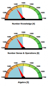
Curriculum function (strand) dials
Explanation of the parts of the dials:
- The red pointer shows your students’ achievement
- The blue shaded area shows the average strand score (or ‘norm’) for the students’ year level. When multiple year levels are included on the report, weighted averages are used to allow fair comparisons.
- The number between square brackets is the number of results displayed
- The width of the red pointer indicates an average e-asTTle measurement error. If there is white or coloured space between the pointer and the edge of the blue area, you can assume there is a statistically meaningful difference between your students’ results and the e-asTTle norm.
Select the image to view it at a larger size.
What else do I need to know?
- Strand scores must be interpreted carefully. They represent scores for students who got three questions right in that strand after any likely guesses were removed. When the test contains relatively few questions in a strand, the strand results will be biased towards the higher achieving students.
- Only the strand options you selected when creating the tests are shown. Other strand dials will be greyed out.
- Be cautious about interpreting dials when there are not many results (that is, a small number in the square brackets).
Why aren’t all students included on the curriculum dials?
Students without strand scores are not included. For e-asTTle to have enough evidence to generate a valid score, at least three questions must be answered correctly.
Unfortunately, this means if there are only four Algebra questions, only students with 3/4 or 4/4 correct are reported. Typically, when some strands don’t have many questions, these dials are biased towards your higher achieving students.
Subject scale box-and-whisker plots
- The red box-and-whisker - your students’ range of overall scores on the test
- The blue box-and-whisker - range of overall score for other e-asTTle students of the same year level.
Overall results are organised by year level. Up to eight year levels with matching norms can be displayed. In instances where more than eight year levels have sat the test, the years with the most students are selected and represented on the report.
See Refresher on box-and-whisker plots
Depth of thinking box and whisker plots
- The red "Surface" box-and-whisker - your students’ range of achievement on questions requiring them to use unconnected lists of information or ideas.
- The red "Deep" box-and-whisker - your students’ achievement on questions requiring them to relate information or ideas to each other, or hypothesise about them more abstractly.
- The number between square brackets is the number of results displayed
The matching blue boxes show the "surface" and "deep" achievement of other e-asTTle students in the same year level. When multiple year levels are included on the report, the data points on the box-and-whisker are weighted to allow fair comparisons.
What else do I need to know?
- Surface and deep plots are not available for Writing tests.
- Be cautious about interpreting surface/deep box-and-whisker plots when there are not many results (that is, a small number in the square brackets).
Attitude score bar
- The red circle shows your students’ average attitude score.
- The blue bar shows scores for other e-asTTle students in the same year level.
For multi-test Console reports, when different tests have been created with different attitude domains, the attitude bar does not display.
Console Report options
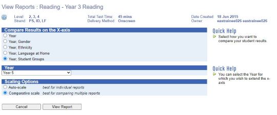
Choosing a scaling option
The scaling option you choose determines which numbers are used as the y-axis on the report.
Auto-scale (Default) - this option "zooms in" to fit the lower and upper quartiles of your group and of the norms. It is the best option when you are looking at just one report at a time.
While it will always have either 50-point or 100-point increments, the minimum and maximum of scale range vary depending on the scores.
Comparative scale - this option "zooms out" to include the full e-asTTle score scale. This is useful when you have two reports from different time periods (or different groups) and you want to compare them side-by-side.
Choosing an x-axis
Your choice of x-axis determines how scores are grouped together.
Year is the default option. This gives separate box-and-whisker plots for each year level. For all other options, you will have to select one year at a time.
Choosing an x-axis
Select the radio button for the option you wish to use.
If you have selected Year/Gender, Year/Ethnicity, Year/Language Groups or Year/Student Groups, a drop-down will appear showing the year levels of students who have completed the test.
Select one year level. (Note that if you select Year/Student Groups and students belong to fewer than seven groups, the report will automatically generate with these groups. If students belong to eight or more groups, a separate panel will display. You must select up to seven groups and add these groups to the Selected Groups box.)
Select "View Report" to view a PDF of the report.
Pānui, Pāngarau, and Tuhituhi tests have options of Gender or Student Groups comparisons only, as there are limited norms for these subjects.
Be mindful of which groups you select to report on. If a student belongs to more than one of the groups that you selected, their result will display in more than one box-and-whisker plot.
For example, Johnny is in both Room 2 and Tiggers Reading groups. Selecting both of these groups will result in Johnny’s score displaying on both box-and-whisker plots.
x-axis options: Year – Gender/Ethnicity/Language at Home
These report options help you work out which effects that are due to group membership and which are due to their instructional experience. For example, you might generate a Console Year x Ethnicity for Year 9.
If your Pacific students are below the norm for Pacific, this result may not be related to ethnicity because Pacific students in other schools are achieving higher on e-asTTle tests. It may be that difference is due to instructional experience.
- Related information


